I recently realized that while I write about a lot of things, I do not often write about the work I’m doing at Portland State and through the Oregon Library Association. I think it comes partly from a desire not to toot my own horn, but it also reflects my nervousness about writing about work (and the politics inherent in that). But it’s silly, because there are so many projects we’ve undertaken that I’m immensely proud of. So I’ve decided to start writing about some of those, the first being Library DIY.
I was one of those people who never asked a reference librarian for help. Ever. And that has really informed my thinking about the reference desk. At Norwich, I worked with my colleagues on various marketing projects to make the reference desk and reference services more visible and approachable. It wasn’t until a couple of year ago that I actually thought about it and realized that I wasn’t avoiding the reference desk because of anxiety. It wasn’t that they seemed unapproachable. It wasn’t that I was overly shy. It was because I stubbornly wanted to figure it out myself. Even now, I will scour a website or listserv archives for help information before asking. And in reading articles about the DIY generation, I realize that I’m not the only one. I see DIY as a respect for the home-grown and the figured-out yourself versus the expert-created or the expert-answered. In an age where the masses (think Yahoo! Answers and the Wikipedia) have largely become the go-to place for information and the expert (think reference librarian) has seen a decline in demand, thinking about how to provide research support without requiring someone to ask a librarian or attend a workshop is critical.
I think libraries need to look at how to make the wisdom of the library available to patrons in an unmediated format. I fully recognize that not all of our patrons fit the DIY stereotype, but I do believe that creating tools that replicate the aspects of the reference interaction on a website will provide all of our students with the tools they need to be successful.
Our answer to this is Library DIY, a system of small, discrete learning-objects designed to give students the quick answers they need to enable them to be successful in their research. I think librarians, when we first started creating learning objects, designed them much in the way that we teach classes. Because they were focused on the way that we teach, they were not really designed to give students quick answers but to teach to specific learning outcomes. Even now when the focus is largely on short tutorials, many are still more ideally designed to be embedded in a LibGuide, shown in a class, or embedded in online courseware. It’s much more common to see tutorials on “the information cycle,” “the art of topic development” and “information types” than tutorials that answer questions like “what types of sources do I need for my paper?”, “how do I know if this article is peer-reviewed?”, and “how do I know if my topic is focused enough?”.
I’ve had the idea for Library DIY in my head for nearly two years (since reading Bohyun Kim’s controversial ACRLog post about DIY patrons), but it wasn’t until we had an instructional designer (for a very brief period last year) that I was able to turn what was in my head into a physical proof of concept. After presenting the mockup to our library faculty and the instructional designers at the Center for Online Learning, the instructional design team got the feedback and support we needed to start making DIY a reality. We contracted with a freelance Drupal designer (who is also a librarian) to skin Drupal and also create the functionality we needed through the use of already existing Drupal plugins. My colleague Amy Hofer and I developed the information architecture, thinking carefully about the paths students might take to get to different pieces of instructional content and how different paths might lead to the same content. It was the craziest flow chart I’ve ever seen, but it made sense to us and I’m really proud of the work we put into that.
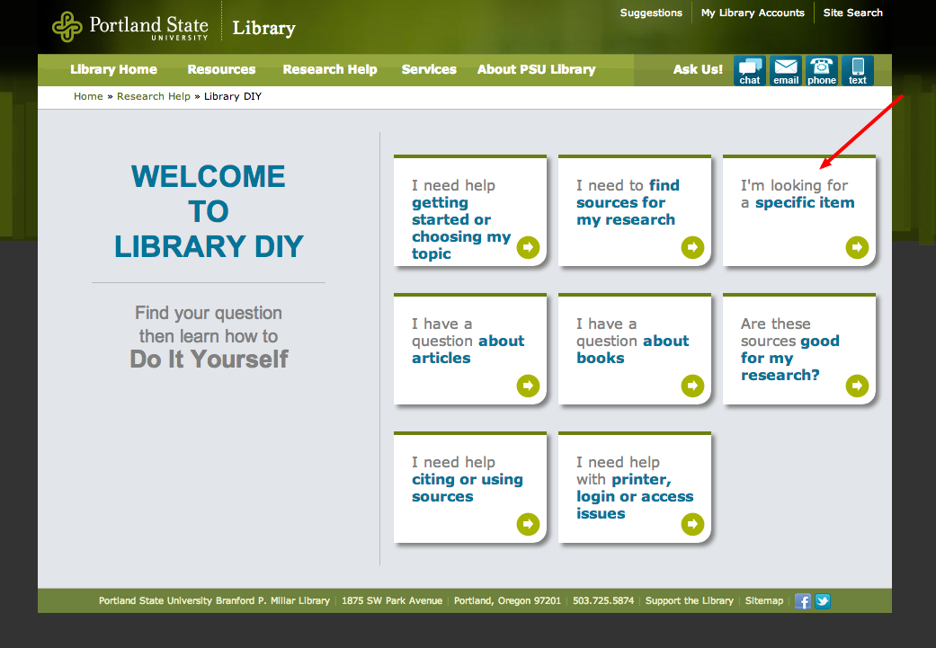
The content in Library DIY is designed to mirror a reference desk transaction more so than an instruction session. Much like in a reference interview (where we elicit more specific information about the student’s need), students can drill down to just the piece of information they need rather than having to skim through a long tutorial to find what they want. The information architecture is task-focused and focused on specific points in the research process. As you can see here, at the home page, students have multiple paths they can take to get to the help content they need (like a “Choose Your Own Adventure” book):
Once they click on one of the front page options, they can select the instructional content specific to their information need:
The instructional content ranges in length from a couple of sentences to about one-page and answers range in complexity from “where can I find newspaper articles?” to “how do I know if a work is significant in my field?”. It’s designed to quickly answer the student’s question without going into the depth we librarians are famous for. If we have additional more detailed web pages or learning objects that speak to their information need, we link to them. On the left-hand side of each instructional DIY page, we include links to related DIY content.
We’re currently finishing up the content development (creating almost 70 pieces of instructional content takes a while!) and are then going to do some usability testing with students before launching in the Fall. One of the big projects for the summer is also to figure out how to make this visible and accessible from the library website, the LMS, and any other places where we can market its existence. You can create great instructional content, but it’s a total waste of time if no one can find it!
My colleague, Amy Hofer (the distance learning librarian), and I presented on DIY and some of our other instructional projects at the Oregon Library Association/Washington Library Association joint conference in April and I also mentioned it in my recent ALA TechSource webinar on the DIY Patron and point-of-need instruction. Already, another University (whose members attended my TechSource webinar) is replicating the project using our information architecture as a starting point. It’s very gratifying to get that kind of validation. Often, during a project like this you start thinking “maybe there’s a good reason why no one has done it before. Maybe it’s a horrible idea!” Seeing other people’s enthusiasm around the idea helps get me out of that unproductive negative thinking loop.
Amy and I weren’t the only people who worked on this project. I’d like to give a big thanks to my partners-in-crime on the instructional design team (Amy, Lisa Molinelli, Kim Willson-St. Clair and Andrea Bullock) who all helped create content and copyedit our title text; our former instructional designer C. K. Worrell; Nathan Mealey, Chris Geib and Mike Flakus in Library Technologies for supporting the project on the back-end; our colleagues in the Center for Online Learning for their monetary support and feedback; and finally, our brilliant Drupal designer, Tom Boone. It truly takes a village to build something like this and I appreciate the willingness everyone had to support this project that we so believed in.


You are such an innovative thinker and I am inspired by your work! The library profession is fortunate to have you. This is fantastic and thanks for sharing!
Pingback: Library DIY: Unmediated point-of-need support |...
Awww thanks Heather! It’s an awesome profession to be in; I don’t think I’d be half as creative if I weren’t inspired by so many awesome people. BTW, I can’t wait to see what your project is all about in the Fall!
Pingback: Around the Web: Harvard Libraries’ mission, Declaration for the right to libraries and more – Confessions of a Science Librarian
I really like the DIY pages, and have been planning to figure out something similar for my frequently asked questions and to use in place of some parts of library instruction. The trick I’ve found is balancing the time it takes to make them vs other guides and instruction. Did you divvy up the DIYs between your librarians, or do you have an instructional designer to help get them up? I hope you didn’t have to do these all yourself, along with everything else! In any case, they look great.
Duh, you said you had an instructional designer in your post. Reading comprehension isn’t going well today.
Hi Kaijsa. We only had an instructional designer for about 3 months (funding issues), so the content was developed by a team of five of us. Many hands definitely make light work. 🙂
This project sounds amazing! Can’t wait to see it live. It’s also great to hear that my former colleagues Lisa and Nathan were involved. 🙂
I think you are right on target with this, especially the framework that you are trying to create a reference interview experience, not a class experience. I use that point to describe why I have a lot of criticism about the typical library guides. Some years ago, the UPenn business library took this approach, see for ex. http://faq.library.upenn.edu/recordList?action=&library=lippincott&institution=Penn&expand=Business+Databases#BusinessDatabases
Thanks Laura. Lisa has been such a breath of fresh air at PSU and Nathan has been a mensch for putting up with my crazy schemes.
Thanks for sharing the link to UPenn, Joan, and for validating my crazy ideas 🙂 It’s especially nice to hear coming from you.
This burrowing down towards small snippets of targeted instruction is the way to go. No one wants a 15 minute orientation video when they have a 30 second question!
And there are a *lot* of “DIY” minded patrons, and we need to serve their needs just as much as the needs of those who want to talk to us directly for help. This is a great tool for them. I wonder how smaller libraries with fewer staff and limited web-design resources might implement a similar concept.
This is brilliant! I can’t wait to see the finished product and dream about copying it! 😉
I love this on so many levels. I think this is the essence of what we were hoping the Guide on the Side would provide for students with tutorials, to have their learning be more self-directed and self-paced. This is the direction we really need to be going and I hope you post a lot more about this project!
I am inspired by your refreshing and thoughtful approach! Thanks for sharing. We are currently re-examining how our online instructional content is being presented and accessed. The truth is that students either can’t find what they need when they need it, or don’t want to give up their time for the instructional tutorial when they find it. DIY looks like the way to go. I would be interested in seeing the information architecture if you would be willing to share. Thanks!
Pingback: Good for what? Considering context in building learning objects. | Information Wants To Be Free
Pingback: Library DIY has been released! | Information Wants To Be Free
Pingback: Library DIY: Unmediated point-of-need support |...
Pingback: #LISMentalHealth: That time my brain and job tried to kill me | Information Wants To Be Free